Description: Nightingale is a Victorian-era survival crafting game where players explore the mysterious Fae Realms, battling enemies, gathering resources, and building estates — playable solo or with friends.
During my playtime, I noticed that the Character Creation Process was the only part that I reflected the games design inspiration. While many of the menus could use an update to better represent the the art style, I decided to focus on the Pause Menu. By using the Character Creation screens and PDF artbook as a template, I could pull from those sources directly as a guide in my design process
Project Deliverables: Rework the Pause Menu to better reflect game’s art style and add an Accessibility tab within the Pause Menu.


Here are a few more design elements that I thought would give me a good starting point to begin designing.
Here are a few more design elements that I thought would give me a good starting point to begin designing. These were sourced from in-game screens or the art book.


A core focus for this case study was to keep in line with the shape language, color palette, and textures that are already in the game.
The images below show some of the vectors I created to construct shapes of components. In this case I used them for a divider. I had a lot of fun figuring out a process to create the look of twisting metal.
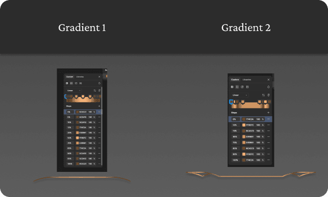
The solution I came up with was looking at contact points of the shapes and manipulating gradients to mimic overlap. I started by making cuts at the contact points and grouping the shapes together. I used the eyedropper tool to determine light, medium, and dark colors and values to create the desired effect. An important part of this process is to note where a light source would be in relation to the shapes and swapping colors around and the overall size of the shapes. Each shape group has multiple gradients with the number of gradients increasing based on the contact points of the shape–more contact points means more gradients needed. The following images show the shapes and gradients attached to them.


The images below show the redesigns of the Pause Menu and its UI elements. A huge challenge to this case study was finding an existing palette in the game that would work well with the text keeping it legible.
The idea of the background for the menu was taken from the in-game Loading Screen. The brownish color of the illustration on the Loading Screen really conveyed the idea of a sketch in an old notebook while the gold accents added to a more fantastical and rich appearance.
While the idea may seem pretty sound, the menu doesn’t have enough contrast to make it legible for a portion of players.
My next update is better defining colors that still reflect the gaslamp fantasy setting while achieving high contrast to make the menu more legible to players.
The image below shows my take on the highlight that appears around a menu option. The idea behind this was inspired by a magnifying glass component from the Character Creation Screen. I later added a light glow to better draw the player’s attention to the selected setting.
The following image is my take on the slider components found in the Pause Menu. I decided to apply twisted metal gradients to this component to give it the look of a control panel.
Did this fix the problem: I would say yes, but in the process, I created another problem of making the information illegible due to value selection.
What would I do differently: Use a color checker and focus on colors that fall within the game's color palette, but have high contrast with each other.


A core focus for this case study was to keep in line with the shape language, color palette, and textures that are already in the game.
The images below show some of the vectors I created to construct shapes of components. In this case I used them for a divider. I had a lot of fun figuring out a process to create the look of twisting metal.
The solution I came up with was looking at contact points of the shapes and manipulating gradients to mimic overlap. I started by making cuts at the contact points and grouping the shapes together. I used the eyedropper tool to determine light, medium, and dark colors and values to create the desired effect. An important part of this process is to note where a light source would be in relation to the shapes and swapping colors around and the overall size of the shapes. Each shape group has multiple gradients with the number of gradients increasing based on the contact points of the shape–more contact points means more gradients needed. The following images show the shapes and gradients attached to them.

The images below show the redesigns of the Pause Menu and its UI elements. A huge challenge to this case study was finding an existing palette in the game that would work well with the text keeping it legible.
The idea of the background for the menu was taken from the in-game Loading Screen. The brownish color of the illustration on the Loading Screen really conveyed the idea of a sketch in an old notebook while the gold accents added to a more fantastical and rich appearance.
While the idea may seem pretty sound, the menu doesn’t have enough contrast to make it legible for a portion of players.
My next update is better defining colors that still reflect the gaslamp fantasy setting while achieving high contrast to make the menu more legible to players.
The image below shows my take on the highlight that appears around a menu option. The idea behind this was inspired by a magnifying glass component from the Character Creation Screen. I later added a light glow to better draw the player’s attention to the selected setting.
The following image is my take on the slider components found in the Pause Menu. I decided to apply twisted metal gradients to this component to give it the look of a control panel.
Did this fix the problem: I would say yes, but in the process, I created another problem of making the information illegible due to value selection.
What would I do differently: Use a color checker and focus on colors that fall within the game's color palette, but have high contrast with each other.


Prototype


Description: Nightingale is a Victorian-era survival crafting game where players explore the mysterious Fae Realms, battling enemies, gathering resources, and building estates — playable solo or with friends.
During my playtime, I noticed that the Character Creation Process was the only part that I reflected the games design inspiration. While many of the menus could use an update to better represent the the art style, I decided to focus on the Pause Menu. By using the Character Creation screens and PDF artbook as a template, I could pull from those sources directly as a guide in my design process
Project Deliverables: Rework the Pause Menu to better reflect game’s art style and add an Accessibility tab within the Pause Menu.


Here are a few more design elements that I thought would give me a good starting point to begin designing.
Here are a few more design elements that I thought would give me a good starting point to begin designing. These were sourced from in-game screens or the art book.


A core focus for this case study was to keep in line with the shape language, color palette, and textures that are already in the game.
The images below show some of the vectors I created to construct shapes of components. In this case I used them for a divider. I had a lot of fun figuring out a process to create the look of twisting metal.
The solution I came up with was looking at contact points of the shapes and manipulating gradients to mimic overlap. I started by making cuts at the contact points and grouping the shapes together. I used the eyedropper tool to determine light, medium, and dark colors and values to create the desired effect. An important part of this process is to note where a light source would be in relation to the shapes and swapping colors around and the overall size of the shapes. Each shape group has multiple gradients with the number of gradients increasing based on the contact points of the shape–more contact points means more gradients needed. The following images show the shapes and gradients attached to them.


The images below show the redesigns of the Pause Menu and its UI elements. A huge challenge to this case study was finding an existing palette in the game that would work well with the text keeping it legible.
The idea of the background for the menu was taken from the in-game Loading Screen. The brownish color of the illustration on the Loading Screen really conveyed the idea of a sketch in an old notebook while the gold accents added to a more fantastical and rich appearance.
While the idea may seem pretty sound, the menu doesn’t have enough contrast to make it legible for a portion of players.
My next update is better defining colors that still reflect the gaslamp fantasy setting while achieving high contrast to make the menu more legible to players.
The image below shows my take on the highlight that appears around a menu option. The idea behind this was inspired by a magnifying glass component from the Character Creation Screen. I later added a light glow to better draw the player’s attention to the selected setting.
The following image is my take on the slider components found in the Pause Menu. I decided to apply twisted metal gradients to this component to give it the look of a control panel.
Did this fix the problem: I would say yes, but in the process, I created another problem of making the information illegible due to value selection.
What would I do differently: Use a color checker and focus on colors that fall within the game's color palette, but have high contrast with each other.


A core focus for this case study was to keep in line with the shape language, color palette, and textures that are already in the game.
The images below show some of the vectors I created to construct shapes of components. In this case I used them for a divider. I had a lot of fun figuring out a process to create the look of twisting metal.
The solution I came up with was looking at contact points of the shapes and manipulating gradients to mimic overlap. I started by making cuts at the contact points and grouping the shapes together. I used the eyedropper tool to determine light, medium, and dark colors and values to create the desired effect. An important part of this process is to note where a light source would be in relation to the shapes and swapping colors around and the overall size of the shapes. Each shape group has multiple gradients with the number of gradients increasing based on the contact points of the shape–more contact points means more gradients needed. The following images show the shapes and gradients attached to them.

The images below show the redesigns of the Pause Menu and its UI elements. A huge challenge to this case study was finding an existing palette in the game that would work well with the text keeping it legible.
The idea of the background for the menu was taken from the in-game Loading Screen. The brownish color of the illustration on the Loading Screen really conveyed the idea of a sketch in an old notebook while the gold accents added to a more fantastical and rich appearance.
While the idea may seem pretty sound, the menu doesn’t have enough contrast to make it legible for a portion of players.
My next update is better defining colors that still reflect the gaslamp fantasy setting while achieving high contrast to make the menu more legible to players.
The image below shows my take on the highlight that appears around a menu option. The idea behind this was inspired by a magnifying glass component from the Character Creation Screen. I later added a light glow to better draw the player’s attention to the selected setting.
The following image is my take on the slider components found in the Pause Menu. I decided to apply twisted metal gradients to this component to give it the look of a control panel.
Did this fix the problem: I would say yes, but in the process, I created another problem of making the information illegible due to value selection.
What would I do differently: Use a color checker and focus on colors that fall within the game's color palette, but have high contrast with each other.


Prototype


Description: Nightingale is a Victorian-era survival crafting game where players explore the mysterious Fae Realms, battling enemies, gathering resources, and building estates — playable solo or with friends.
During my playtime, I noticed that the Character Creation Process was the only part that I reflected the games design inspiration. While many of the menus could use an update to better represent the the art style, I decided to focus on the Pause Menu. By using the Character Creation screens and PDF artbook as a template, I could pull from those sources directly as a guide in my design process
Project Deliverables: Rework the Pause Menu to better reflect game’s art style and add an Accessibility tab within the Pause Menu.


Here are a few more design elements that I thought would give me a good starting point to begin designing.
Here are a few more design elements that I thought would give me a good starting point to begin designing. These were sourced from in-game screens or the art book.


A core focus for this case study was to keep in line with the shape language, color palette, and textures that are already in the game.
The images below show some of the vectors I created to construct shapes of components. In this case I used them for a divider. I had a lot of fun figuring out a process to create the look of twisting metal.
The solution I came up with was looking at contact points of the shapes and manipulating gradients to mimic overlap. I started by making cuts at the contact points and grouping the shapes together. I used the eyedropper tool to determine light, medium, and dark colors and values to create the desired effect. An important part of this process is to note where a light source would be in relation to the shapes and swapping colors around and the overall size of the shapes. Each shape group has multiple gradients with the number of gradients increasing based on the contact points of the shape–more contact points means more gradients needed. The following images show the shapes and gradients attached to them.


The images below show the redesigns of the Pause Menu and its UI elements. A huge challenge to this case study was finding an existing palette in the game that would work well with the text keeping it legible.
The idea of the background for the menu was taken from the in-game Loading Screen. The brownish color of the illustration on the Loading Screen really conveyed the idea of a sketch in an old notebook while the gold accents added to a more fantastical and rich appearance.
While the idea may seem pretty sound, the menu doesn’t have enough contrast to make it legible for a portion of players.
My next update is better defining colors that still reflect the gaslamp fantasy setting while achieving high contrast to make the menu more legible to players.
The image below shows my take on the highlight that appears around a menu option. The idea behind this was inspired by a magnifying glass component from the Character Creation Screen. I later added a light glow to better draw the player’s attention to the selected setting.
The following image is my take on the slider components found in the Pause Menu. I decided to apply twisted metal gradients to this component to give it the look of a control panel.
Did this fix the problem: I would say yes, but in the process, I created another problem of making the information illegible due to value selection.
What would I do differently: Use a color checker and focus on colors that fall within the game's color palette, but have high contrast with each other.


A core focus for this case study was to keep in line with the shape language, color palette, and textures that are already in the game.
The images below show some of the vectors I created to construct shapes of components. In this case I used them for a divider. I had a lot of fun figuring out a process to create the look of twisting metal.
The solution I came up with was looking at contact points of the shapes and manipulating gradients to mimic overlap. I started by making cuts at the contact points and grouping the shapes together. I used the eyedropper tool to determine light, medium, and dark colors and values to create the desired effect. An important part of this process is to note where a light source would be in relation to the shapes and swapping colors around and the overall size of the shapes. Each shape group has multiple gradients with the number of gradients increasing based on the contact points of the shape–more contact points means more gradients needed. The following images show the shapes and gradients attached to them.

The images below show the redesigns of the Pause Menu and its UI elements. A huge challenge to this case study was finding an existing palette in the game that would work well with the text keeping it legible.
The idea of the background for the menu was taken from the in-game Loading Screen. The brownish color of the illustration on the Loading Screen really conveyed the idea of a sketch in an old notebook while the gold accents added to a more fantastical and rich appearance.
While the idea may seem pretty sound, the menu doesn’t have enough contrast to make it legible for a portion of players.
My next update is better defining colors that still reflect the gaslamp fantasy setting while achieving high contrast to make the menu more legible to players.
The image below shows my take on the highlight that appears around a menu option. The idea behind this was inspired by a magnifying glass component from the Character Creation Screen. I later added a light glow to better draw the player’s attention to the selected setting.
The following image is my take on the slider components found in the Pause Menu. I decided to apply twisted metal gradients to this component to give it the look of a control panel.
Did this fix the problem: I would say yes, but in the process, I created another problem of making the information illegible due to value selection.
What would I do differently: Use a color checker and focus on colors that fall within the game's color palette, but have high contrast with each other.


Prototype